Carlota, one of the most iconic restaurants in Brazil, was founded in 1995 by chef Carla Pernambuco, who brought home the culinary influences of her training in New York and her passion for multicultural cuisine.
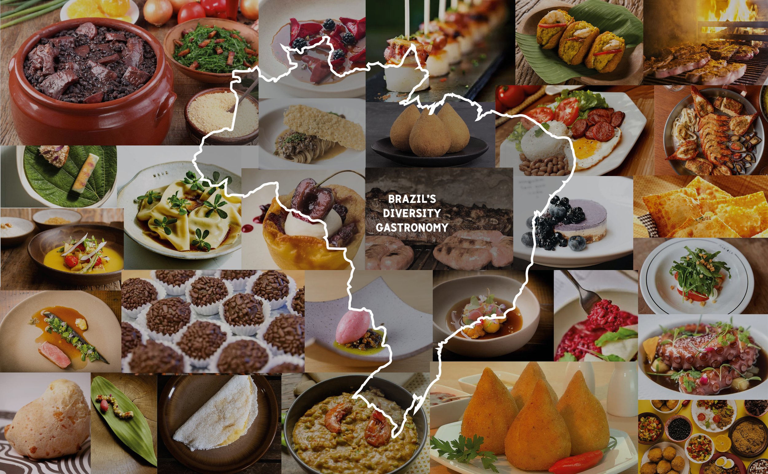
While Carlota introduced São Paulo to inventive combinations and international inspirations, it was the reinterpretation of traditional Brazilian dishes that made the restaurant truly stand out. Carla’s ability to elevate these staples using contemporary methods and global references positioned Carlota at the forefront of Brazil’s gastronomic evolution, earning accolades such as Veja São Paulo’s best contemporary cuisine multiple times. The restaurant’s upcoming expansion and evolving menu reflect not just a desire to innovate, but a dedication to showcasing the richness and versatility of Brazilian food culture on a contemporary stage.
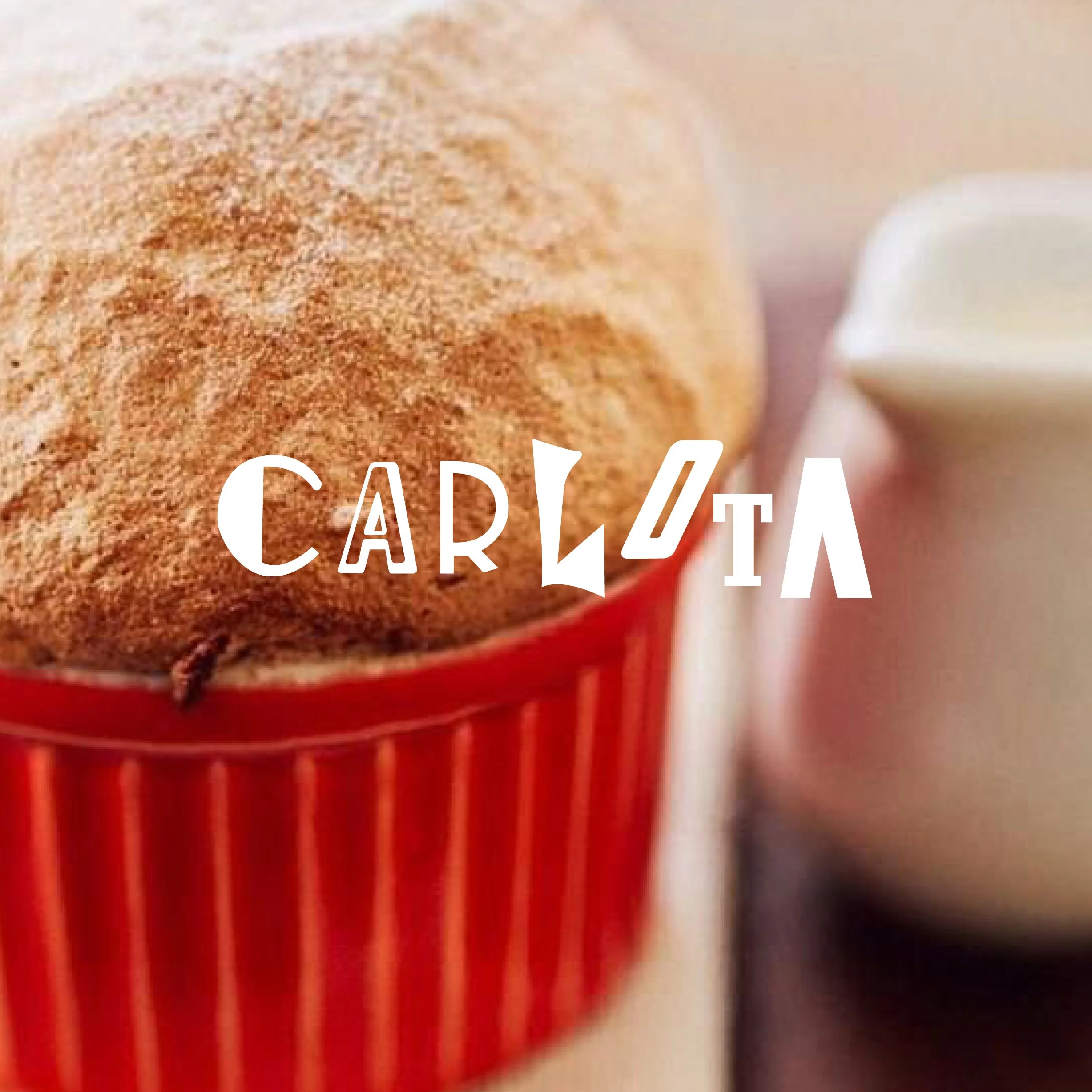
To celebrate Carlota’s 30th anniversary in a meaningful and forward-looking way, chef Carla Pernambuco also embraced a visual transformation by updating the restaurant’s brand identity. The goal was to create a new logo and design system rooted in the richness of Brazilian graphic design. Just as Carla blends ingredients from different influences to create dishes that express the soul of Brazilian cuisine, the new identity was crafted by mixing typographic elements from various eras of Brazil’s design history.
Extensive research into vintage Brazilian design books and archives guided the creative process. The result is a unique visual language: three distinct logos, each built from letterforms inspired by different decades of Brazilian graphic design. These logos are intended to be used flexibly and interchangeably, echoing the restaurant’s dynamic and layered culinary philosophy.
The rebranding reflects Carlota’s essence—contemporary, rooted, and full of personality. It’s a visual homage to the same cultural richness that defines the menu, offering a fresh yet familiar look that celebrates Brazilian identity through both taste and design.